The Email Signature: A Small Detail That Says a Lot
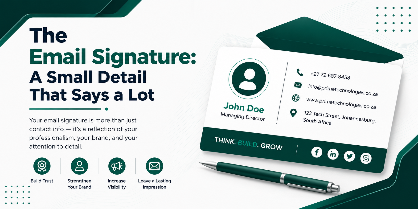

The Email Signature: A Small Detail That Says a Lot
You probably spend more time crafting the subject line of an email than you do thinking about the signature sitting at the bottom of it. Yet that little block of text is one of the most consistently seen pieces of branding you’ll ever produce — showing up dozens or hundreds of times a day, in every reply, forward, and thread it touches. Getting it right is a small effort with an outsized payoff.
Why It Matters More Than You’d Think
A signature does three jobs at once. It tells the recipient who you are and how to reach you through other channels. It reinforces your (or your company’s) brand every single time someone opens an email. And it quietly signals professionalism — a sloppy, cluttered, or outdated signature can undercut an otherwise polished message.
What Belongs in a Good Signature
The essentials:
- Full name
- Job title
- Company name
- One reliable way to reach you beyond email — usually a phone number
Often useful:
- Company logo (small, sized to not overwhelm the text)
- Website link
- One or two relevant social/professional links (LinkedIn is the most common)
- A physical address, if it’s genuinely relevant to your work (law firms, medical practices, and retail locations often include this)
Use sparingly, if at all:
- Inspirational quotes
- Multiple phone numbers or fax lines
- Company disclaimers (legal or compliance teams sometimes require these — check before dropping them)
- Banner ads or promotional graphics
- More than two colors beyond your brand palette
Common Mistakes That Undercut a Signature
Too much information. A signature with five phone numbers, three social icons, a quote, and a legal disclaimer stops being a signature and starts being a wall of text nobody reads. Trim it to what someone would actually use.
Inconsistent formatting across a team. If everyone in a company designs their own signature, the inbox ends up looking disorganized. Most organizations benefit from a shared template that individuals fill in with their own details.
Oversized images. A large logo or headshot can break formatting on mobile devices or get flagged as an attachment by some email clients. Keep images small and compressed.
Outdated details. A signature listing an old job title, a defunct phone extension, or a dead link does more harm than no signature at all — it makes the sender look inattentive.
No mobile consideration. A large percentage of email is now read on phones. A signature designed only for a wide desktop screen can wrap awkwardly or look cramped on a small one.
A Simple, Effective Structure
Most well-designed signatures follow a layout like this:
[Name]
[Job Title] | [Company Name]
[Phone Number]  |  [Website]
[LinkedIn or one relevant link]
That’s it. Four lines, no clutter, and everything the recipient might actually need.
Personal vs. Company Signatures
A freelancer or individual professional has more room to add a bit of personality — a short tagline, a portfolio link, maybe a subtle touch of color. A signature representing a company, on the other hand, should generally follow a consistent brand template so that every employee’s emails feel like they’re coming from the same organization, not five different ones.
A Quick Gut Check Before You Finalize Yours
Ask whether each line earns its place: Does this help the recipient reach me or understand who I am? If not, it’s probably safe to cut. A signature that’s easy to scan in two seconds does its job far better than one crammed with everything you could possibly include.